Sunday, September 28, 2008
Marvelous Mats
Everything you always wanted to know but were too afraid to ask ...
George Jestson's boss was named Cosmo Spacely.
Tuesday, September 23, 2008
A summary of graphic design since 2000
- Better and more accurate printing
- New computer programs allow for faster, and sometimes easier, design
- Designs and typography need to be able to cross media - cell phones, computers, TV, etc.
The idea of the universal message is questioned. Designs become more personalized to the location of their target audience. For example, a design made to be used in the U.S. would probably not work as well in China.
Some typefaces designed since 2000
Question: What is one problem that new technology has presented to the design industry?
While I was trying (and failing) to find more on design since 2000 I stumbled on a website listing the recipients of awards for "Good Design 2000: An International Industrial and Graphic Design Competition." Ironically, this is one of the most painful websites I have ever had the misfortune of looking at.
Fonts from:
http://www.identifont.com/index.html
And now for something completely different....
I'm too tired to find a useless fact. Maybe I need some Powerthirst - it has lightning. Real lightning.
Tuesday, September 16, 2008
The FUNdamentals of Type HW
- Absolute Measurement – expressed in finite terms (inches, millimeters, points, picas…)
- Relative Measurement – linked to type size, based on a percentage (character spacing, leading…)
- Points/Picas – standard measurement units of type, refers to height of type block, one point = 1/72 of an inch, twelve points per pica
- x-height – height of the main body of lower case letters, usually slightly more than half of the cap height, the bigger the x-height the bigger the font may seem
- The em – relative unit of measurement, equals size of type, used for defining elements (paragraph indents, spacing…)
- The en – relative unit of measurement, half of the em, to denote nested clauses, can also mean “to”
- Dashes (hyphen, en, em) – short, horizontal rules, measurements used to decide length of dashes, hyphen = one third of an em
- Alignments: Justification, Flush Left, Flush Right – position of type within a text block, vertical and horizontal planes; justification = forcing the text to fill the space (either horizontally or vertically), hyphenation can help spacing problems; flush left = follows principle of handwriting, text aligned to left and ragged on right, flush right = less common, difficult to read
- Letterspacing – increase space between letters
- Kerning – decrease space between letters
- Tracking – adjusting the space between letters
- Word Spacing – adjusting the space between words
- Widow – lone word at the end of a paragraph
- Orphan – last one or two lines of a paragraph separated from the main body by the creation of a new column
- Leading – space between lines of text in a text block
- Indent, Fist Line Indent, Hanging Indent – provides reader with an entry point to a paragraph; first-line indent = first line in the second and later paragraphs are indented from the left margin; hanging indent = indent from the left or right margin on several lines of text, first line is not indented

Everything you always wanted to know, but were too afraid to ask...
The flavor and texture of shrimp are influenced by the waters they come from or are raised in.
Saturday, September 6, 2008
Adrian Frutiger
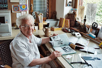
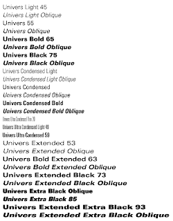
 Adrian Frutiger is a world famous font designer from Switzerland. He became interested in the world of type at a young age and pursued a classical education in that area. From age sixteen, where he apprenticed as a printer, he was employed at that reflected his interest in typography and art. He soon began experimenting with his own type forms. His first font design was Phoebus, but the one that cemented his fame was Univers. Univers is a widely popular sans-seraph font with a large x-height and an even stroke weight. This style is uniquely applicable, seemingly with a stylistic variation for every occasion. Although it has been suggested to avoid using this typeface for extremely lengthy works (like a book), it is surprisingly usable for just about any other typographic need. Another rather exclusive feature to Univers is the organizational grid. Instead of referring to each of the styles within the Univers family only by name, Frutiger developed a number system. Each of the variations of the Univers has a number that corresponds to its characteristics. The first digit is based on the line weight and the second is based on letter width and position. He created twenty eight type designs other than Phoebus and Univers including Westside, Avenir, Frutiger, and President.


Sources:
http://typophile.com/node/12118
http://www.myfonts.com/person/frutiger/adrian/
http://www.identifont.com/show?110
http://www.artandculture.com/cgi-bin/WebObjects/ACLive.woa/wa/artist?id=190
http://www.monotypeimaging.com/ProductsServices/TypeDesignerShowcase/AdrianFrutiger/
http://www.fonts.com/findfonts/detail.htm?pid=242535
http://en.wikipedia.org/wiki/Univers
http://www.thescienceofcreativity.com/0/77
Everything you always wanted to know, but were too afraid to ask...
There are about 75,000 scientifically identified species of fungi.
http://www.wisegeek.com/how-many-species-of-fungi-are-there.htm
John Baskerville
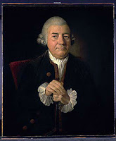
 Although John Baskerville was the creator and namesake of a typeface that is now widely used, his work suffered from criticism while he lived. In fact, Baskerville’s type only became popular in the 1920’s, almost one hundred fifty years after his death. The type is characterized by its clarity, vertical emphasis, almost horizontal serifs, and the marked difference in stroke width. This transitional type face is ideal for book making because of its legibility. It is known as a “transitional” type. Baskerville lived and worked in his native England. He worked as a stone carver, calligrapher, and printer as well as a type designer. In all his areas of work he strove for perfection. To further this goal, he made several innovations in the field of printmaking including a darker ink with a faster drying time, better paper, and hot pressing his pages. By pressing his just printed pages between hot copper plates he simultaneously set the ink in to the pages more than previously possible and smoothed the paper. Unlike many of his contemporaries, Baskerville favored legibility over ornamentation. He withheld many of the flourishes of other printers in his designs. He also increased the margin because he viewed the white negative space as intrinsic to his designs.
 http://www.myfonts.com/person/baskerville/john/
http://ilovetypography.com/2007/09/23/baskerville-john/
http://www.myfonts.com/fonts/storm/john-baskerville/familytree.html
http://users.1st.net/jweinstein/AA210f/Type210/Bask.html
http://www.graphic-design.com/Type/typography.html
Everything you always wanted to know, but were too afraid to ask...
Mildred was the 6th most popular name for girls in 1917.
http://www.ssa.gov/cgi-bin/popularnames.cgi


