-- Parts of the grid: what are the following: margin, column, alley, module, gutter, folio. Margins are the spaces surrounding the grid that are typically left blank. Columns are the areas in a grid that text is placed to give order. A module is a single organizational or divisional element element (a little box) in a modular grid. Gutters are the inner two margins of facing pages. Folios are page numbers and are usually placed on the outer edge of a page to aid navigation.
-- What are the advantages of a multiple column grid? Multiple column grids allow the designer more freedom and provide a more flexible format.
-- Why is there only one space after a period? The characters on a computer are proportional, not monospaced.
-- What is a character (in typography)? Characters are any letter, number, space, or punctuation mark.
-- How many characters is optimal for a line length? words per line?
-- Why is the baseline grid used in design? So all text, no matter what its size, lines up.
-- What is a typographic river?
-- What does clotheslining or flow line or hangline mean? These terms refer to an imaginary horizontal line running through the top of a page. Most of the top blocks of text, pictures, etc. should “hang” off of the line. This line helps lead the reader across the page and creates stronger designs.
-- How can you incorporate white space into your designs?
-- What is type color/texture mean?
-- What is x-height, how does it effect type color? The x-height is the height of the main part of a lowercase letter. When the x-heights of a font are smaller, they create the impression of a condensed black line crossing the page whereas fonts with larger x-heights tend to look greyer.
-- Define Tracking. Tracking is the process of adjusting the spacing between letters.
-- Define Kerning. Why doe characters need to be kerned? What are the most common characters that need to be kerned (kerning pairs)? Kerning is the process of removing small spaces between letters to create visually-consistent letterspacing. The most common kerning pairs are: H and L, H and O, O and C, O and T, and A and T.
-- In justification or H&J terms what do the numbers: minimum, optimum, maximum mean?
-- What is the optimum space between words?
-- What are some ways to indicate a new paragraph. Are there any rules? To indicate new paragraph you can either add a few points in a box usually called after or you can indent the paragraph. Don’t do both; it’s redundant.
-- What are the rules associated with hyphenation? Avoid more than two hyphenations in a row. Avoid too many hyphenations in a paragraph. Avoid stupid hyphenations. Never hyphenate in a heading. Break lines sensibly.
-- What is a ligurature? Liguratures are the combinations of two letters. A common one is the & symbol which is made of the letters E and T.
-- What does CMYK and RGB mean? They are different color systems. CMYK stands for cyan, magenta, yellow, and black and is used when preparing for print. RGB stands for red, green, and blue and is for on-screen use.
-- What does hanging punctuation mean? Hanging punctuation is useful when there are quotes separated from the main body of text or other situations where punctuation can look a little “off.” The program adjusts the format slightly so the text beneath the first line is lined up with the text above and not the quotation mark.
-- What is the difference between a foot mark and an apostrophe? What is the difference betweenan inch mark and a quote mark (smart quote)? Foot marks and inch marks are straight up and down. Apostrophes and quote marks curve or angle slightly.
-- What is a hyphen, en dash and em dashes, what are the differences and when are they used. Hyphens are the shortest of the dashes (1/3 of an em) and are used for hyphenating words (duh) and for line breaks. En dashes are ½ an em and are used between words indicating a duration. They are used where the word “to” could go. They are also used in compound adjectives when one of the two elements is already made of two words or is already hyphenated. Em dashes are used in a similar manner as colons or parentheses or it indicates an abrupt change in thought. There should be no spacing around the em dash.
-- What is a widow and an orphan? A widow is a lone word at the end of a paragraph (or seven or fewer characters). An orphan is created when the last one or two lines of a paragraph are separated from the main body by the creation of a new column.
Wednesday, December 3, 2008
Thursday, November 13, 2008
Helvetica the film
I thought it was a pretty good film, which surprised me. It did get a little long at some points, but most of it was interesting. I wasn't even aware that there was a debate about Helvetica... And who knew you could get so impassioned about a font? I guess what I got from the film is that Helvetica is versatile, but you shouldn't use it just because you can and ignore every other option out there. Don't jump on the Helvetica bandwagon, or something like that. I have also started noticing it more around town.
Everything you always wanted to know, but were too afraid to ask...
Each human head carries roughly 100,000 hair follicles.
http://www.pg.com/science/haircare/hair_twh_23.htm
Everything you always wanted to know, but were too afraid to ask...
Each human head carries roughly 100,000 hair follicles.
http://www.pg.com/science/haircare/hair_twh_23.htm
Thursday, November 6, 2008
Carlos Segura Paper

Carlos Segura is one of today’s most well known and influential designers. He has won multiple awards such as Europe’s 2004 Red Dot Award for his continuing work with Corbis on their publication Crop as well as earning multiple certificates of award, in the United States and abroad, for his work. Segura was born in Santiago, Cuba in 1956 but soon moved to Miami, Florida when he was nine. He joined a band at age twelve and stayed with them until he was nineteen. During this time he acted as their drummer, driver, and promoter. This was his first introduction to design. Unlike many other of his well know contemporaries, Segura never pursued a degree in design. He picked up knowledge as he went along. One of his first jobs after leaving the band was designing the return addresses on bank deposit envelopes. He had several different jobs before he got his first big break at an ad agency in New Orleans. He changed jobs a few more times before his move to Chicago, Illinois. In Chicago he worked for such companies as Young & Rubicam, HCM Marstellar, Foote Cone & Belding, Ketchum, DDB Needham, FCB, Bayer Bess Vanderwacker, and BBDO as an art director. Although Segura was well known and extremely successful at this time, he was dissatisfied with the work he was doing.
Instead of making yet another job switch, he decided to start his own design firm, Segura Inc., in 1991. Carlos Segura and his wife and business partner Sun still run the design firm today in Chicago. Over the years, Segura Inc. has become multifaceted. Segura developed and oversees the five connected businesses: Segura Inc., [T-26] Digital Type Foundry, 5inch, Cartype, and Thickface. Segura Inc. is somewhat similar to many design firms today. They work on designs for graphics, advertising, branding, and print collateral. Segura Inc. has worked on projects for CafeFX, Dictionary.com, American Eagle, Nissan Altima, DC Comics, Rock the Vote, Corbis, Garbage, Nintendo, and Penske Racing among many others. Although Segura Inc. takes on similar types of clients as other design firms, it has qualities that set it apart from the crowd and make it one of the forerunners of the design industry. The first of these qualities centers on Carlos Segura’s belief in embracing new, and sometimes untried, technology and design solutions. In fact, Segura is known for saying that “Communication that doesn’t take a chance, doesn’t stand a chance.” Another way that Segura, Inc. is different from other design firms is the number of employees. For a firm that is known internationally as being one of the best, Segura Inc. does not have an overabundance of workers. A third quality that sets Segura Inc. and its owner apart is the amount of freedom that the employees have in the workplace. Carlos Segura has said that “I’ve only had six good clients in my career. I define [a good] one as ‘allowing me to what they hired me to do.’ I try very hard to do the same when I hire someone.” This means that he allows his workers to have a certain amount of freedom. Another quality is Segura Inc.’s devotion to founding a cohesive partnership with its clients. Carlos Segura does not believe in aiming only for quick, one time projects. Instead, he works on nurturing relationships with his clients that will bring them back to Segura Inc. again and again. One of the ways he does this is by treating his clients the way he expects to be treated: courteously, professionally, and with understanding. All of these qualities that are in Segura Inc. are also present in Carlos Segura’s other ventures.
The next business that Segura founded was [T-26] Digital Type Foundry in 1994, three years after first starting Segura Inc. [T-26] Digital Type Foundry was one of the first among its kind. He saw the establishment of [T-26] Digital Type Foundry as a solution to several problems he had encountered in his time as a designer as well as those he could see occurring in the near future. Firstly, he realized that it was more difficult than it had to be for a business, or anyone for that matter, to find a font. These people were pretty much forced to either search manually for a typeface or go to someone to have him or her design a whole new font. Segura saw no reason for this. He made ease of access a big concern when he founded [T-26] Digital Type Foundry. [T26] Digital Type Foundry was one of the very first type foundries to be web based. Most of their business is conducted online. He also made an effort to expand the customer’s user license. At the time that the company was first introduced, other type foundries were making people purchase one copy of a font per each computer they planned to install it on. Segura understood that this was unnecessarily costly for the user and realized that people were probably falsely representing the number of computers used in order to escape the extra cost. He decided to allow the type purchases from [T-26] Type Foundry to be installed on ten separate computers by people customer. Also, the customer has the chance to purchase licensing for an additional computer at only two percent of the original cost. Segura figured that this would cut back on the number of people stealing as well as allowing his business to be more user friendly. Segura also saw the benefits of relaxing some rules for service bureaus. Instead of making every third party printing company buy [T26] Digital Type Foundry’s fonts if they were used within the product that they were printing, he allowed them to go ahead and print without an additional cost, as long as the printing company did not archive the font. As with the previous point about installing fonts on multiple computers, Carlos Segura was aware that people were already doing this and he may as well make it legal. He also made this change in order to prevent any mistakes in printing, which would have cost his actual customers, not the service bureau, money. He also helped fulltime student afford the cost of fonts from [T-26] Type Foundry. Fulltime students are able to purchase any font from the website at a forty percent discount. Carlos Segura was also interested in donating some of [T26] Digital Type Foundry’s proceeds towards charitable organizations. He has donated money towards organizations dealing with AIDS as well as giving parts of the library of typefaces to organizations like AIGA. Lastly, Segura encouraged everyone and anyone to send work into [T26] Digital Type Foundry. This is especially helpful for designers that are just graduating from college and others who have little experience and are not well known. These beginning designers are treated just as seriously as well established designers at [T26] Digital Type Foundry.
Carlos Segura’s third business venture is a company called 5inch. Segura launched 5inch in 2001 after he noticed that there was a market for blank silk screened CDRs and DVDs, but no one else had taken advantage of it. There was no place that the average person could go if he or she wanted a blank disc with some design. Currently, 5inch has fifty different designs for CDRs and nine different DVD designs. Furthermore, 5inch will actually allow people to make their own design to be silkscreened onto the disk for an additional fee. 5inch also sells cases and hubs for their discs as well as wearable merchandise. Segura’s final two ventures were probably started because of his other hobbies and interests. Segura’s love of music can still be seen today, many years after he left his band. Thickface is an independent record label that was started in 1996 and is currently managed through [T26] Digital Type Foundry. Thickface has recorded for bands such as NYCO for their 2005 release Two. Carlos Segura’s last venture is a website called CarType. Segura has a passion for anything with an engine and that is reflected in this website which, as its name suggests, explores the history and trends of typography in the automobile industry as well as the cars themselves. Although Carlos Segura has set up five separate companies, they still are cohesive and unified. Each venture brings something different and useful to the table. 5inch, Thickface, and Cartype are benefited from Segura Inc.’s advertising and [T26] Digital Type Foundry’s typeface designs. Segura Inc. and [T26] Digital Type Foundry benefit from their business as well as benefiting from the other companies’ exposure.
Carlos Segura’s business ethics and principles are evident in his design. His philanthropic efforts with [T26] Digital Type Foundry are reflected in his mission to bring as much fine art as possible into everyday design. He loves the work that he does and wants others to be aware of it. Although his designs are extremely varied, he has said that he gets a lot of his inspiration from Japan and London.
Fonts designed by Carlos Segura:
· Boxspring
· Faxfont
· Faxfont Fine
· Faxfont Standard
· Faxfont Tone
· Flaco Inline
· Flaco Solid
· Peepod
· Pintor
· RPM
· Sport
· Square 40
· Square 40 Outline
· Square 45 Thin
· Time in Hell
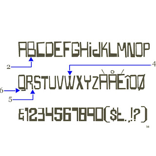
Boxspring is a sans serif font Carlos Segura designed in 1995.
Six facts about Boxspring:
1. it is geometric
2. the horizontal strokes are often wider than the vertical
3. it is entirely in caps
4. the crossing part on the “W” is filled in
5. the leg of the “R” is jagged
6. the tail of the “Q” bends back towards the left
Six facts about Boxspring:
1. it is geometric
2. the horizontal strokes are often wider than the vertical
3. it is entirely in caps
4. the crossing part on the “W” is filled in
5. the leg of the “R” is jagged
6. the tail of the “Q” bends back towards the left

What (else) happened in 1995?
· terrorist attack in Oklahoma City kills 168 on April 19
· the internet becomes commercial and widely used
· peace treaty signed to halt three years of fighting in Bosnia on December 14
· eBay is founded
· Windows95 is released
· terrorist attack in Oklahoma City kills 168 on April 19
· the internet becomes commercial and widely used
· peace treaty signed to halt three years of fighting in Bosnia on December 14
· eBay is founded
· Windows95 is released


This is a link to a video of a short interview with Carlos Segura.
"massaging of your life"... that has to be one of the weirdest expressions I have ever heard.
Sources:
"1995: A look back." CNN. 6 Nov. 2008 .
5inch. 6 Nov. 2008.
Arber, Jason. "Carlos Segura." Pixelsurgeon. 6 Nov. 2008.
"Carlos Segura." Identifont. 6 Nov. 2008.
CarType. 6 Nov. 2008.
Drate, Spencer, and Judith Salavetz. Swag 2: Rock Posters of the '90s and Beyond. New York: Abrams, 2005.
Fiell, Charlotte, and Peter Fiell. Graphic Design for the 21st Century: 100 of the World's Best Graphic Designers. N.p.: Taschen, n.d.
"Fireside Chat: Richard Bird, Jim Coudal, and Carlos Segura ." 37signals. 6 Nov. 2008.
Fishel, Cathy. "Japan Honors Carlos Segura." U&LC Online. Upper and Lower Case Magazine. 6 Nov. 2008.
Logo Design. Ed. Julius Wiedemann. Los Angeles: Taschen, n.d.
Segura Inc. 6 Nov. 2008.
[T26] Digital Type Foundry. 6 Nov. 2008.
"TDC Annual Awards 2001, Bronze Prize : Carlos Segura." TOKYOTDC. 6 Nov. 2008.
5inch. 6 Nov. 2008
Arber, Jason. "Carlos Segura." Pixelsurgeon. 6 Nov. 2008
"Carlos Segura." Identifont. 6 Nov. 2008
CarType. 6 Nov. 2008
Drate, Spencer, and Judith Salavetz. Swag 2: Rock Posters of the '90s and Beyond. New York: Abrams, 2005.
Fiell, Charlotte, and Peter Fiell. Graphic Design for the 21st Century: 100 of the World's Best Graphic Designers. N.p.: Taschen, n.d.
"Fireside Chat: Richard Bird, Jim Coudal, and Carlos Segura ." 37signals. 6 Nov. 2008
Fishel, Cathy. "Japan Honors Carlos Segura." U&LC Online. Upper and Lower Case Magazine. 6 Nov. 2008
Logo Design. Ed. Julius Wiedemann. Los Angeles: Taschen, n.d.
Segura Inc. 6 Nov. 2008
[T26] Digital Type Foundry. 6 Nov. 2008
"TDC Annual Awards 2001, Bronze Prize : Carlos Segura." TOKYOTDC. 6 Nov. 2008
Everything you always wanted to know, but were too afraid to ask...
The pomegranate originated in the area from Iran to the Himalayas in northern India.
Wednesday, November 5, 2008
Redesigning the stop sign and Crazyness
I was working on my typography paper and this was posted on my typographer's website. It's good fun.
Also, here is another video. This had to have taken forever and a day. And I thought frame by frame animation in Flash was a pain...
Everything you always wanted to know, but were too afraid to ask...
Archaeologists have found fragments of cotton cloth dating as far back as 3000 B.C.
http://www.cottonsjourney.com/Storyofcotton/page2.asp
Friday, October 24, 2008
Monday, October 13, 2008
Carlos Segura Outline

Part A:
- date of birth, place of birth, (death):
born in 1956 in Santiago, Cuba
- training or education:
promotions for the band
first job at an envelope manufacturer
- milestones in their life:
United States in 1965
in a band from 12-19
"first big break" in New Orleans (date?)
moved to Chicago in 1980 - met wife here (who is also his business partner)
worked for Marsteller, Foote Cone & Belding, Young & Rubicam, Ketchum,
DDB Needham, BBDO
founded Segura Inc. in 1991
T-26 begun in 1994
5inch.com begun in 2001
named one of the most influential graphic designers ( in Graphic Design for the 21st Century) in 2004
- is he/she attached to some art movement or style, if so explain:
"blending as much “fine art” into “commercial art” as he could"
Fonts designed by Carlos Segura:
Sources:
Websites -
Books:
Graphic Design for the 21st Century
Swag 2 : rock posters of the '90s and beyond
Logo design
(I haven't had a chance to pick the last two up from KC - I don't know if they will actually be useful)
If anyone knows of any other books/websites that have stuff on Carlos Segura please let me know!
Everything you always wanted to know, but were too afraid to ask...
The LEGO Automatic Binding Brick with four and eight studs was released in 1949.
Sunday, October 12, 2008
Alice in Wonderland electronica style
That's right - electronica. It's kinda entertaining.
http://buzzfeed.com/scott/alice
I think the editing was very well done. The beat of the music and the actions on the movie clip match up nicely and everything. It's a pretty good example of what kind of editing you can do on the computer for anyone who is going to do a movie/animation for visual concepts.
Everything you always wanted to know, but were too afraid to ask ...
According to Pliny the Elder, the Phoenicians were using soap as early as 600 B.C.
http://www.droyt.com/soap-facts.html
Monday, October 6, 2008
Chronicle Books

I was considering making a book for the visual concepts project 3 (yes, oodles of extra work and crafting issues - blah) and I came across the Chronicle Books website. There is a pretty huge variety of coffee table style books that they publish. They range from the lame (Heirloom Beans), to the naughty sounding (XXX Porn for Women), to the holy-crap-I-f***ing-hate-fish-now (Ichthyo: The Architecture of Fish), to the what-the-hell (Poo Log - I'm not even joking). And actually, the fish book looks pretty nifty. It has x-rays of fish. Another interesting one is the World Unfurled. So, if you like books, pretty pictures, or are really bored I suggest that you take a look see. This company also offers a design fellowship for recent design graduates that might be a really awesome experience.
Everything you always wanted to know but were too afraid to ask...
Saturn has fifty-two known natural satellites.
Sunday, September 28, 2008
Marvelous Mats
This is a pretty useful website for anyone who decided to undertake the HELL that is cutting your own mats. It probably has more information than you would ever want to know, but on the second page there is a list of common problems that may be useful.
Everything you always wanted to know but were too afraid to ask ...
George Jestson's boss was named Cosmo Spacely.
Everything you always wanted to know but were too afraid to ask ...
George Jestson's boss was named Cosmo Spacely.
Tuesday, September 23, 2008
A summary of graphic design since 2000
New technology creates problems as well as solutions:
- Better and more accurate printing
- New computer programs allow for faster, and sometimes easier, design
- Designs and typography need to be able to cross media - cell phones, computers, TV, etc.
The idea of the universal message is questioned. Designs become more personalized to the location of their target audience. For example, a design made to be used in the U.S. would probably not work as well in China.


Some typefaces designed since 2000
 Anasdair (2003)
Stratum (2004)
 Broke Five (2001)
Question: What is one problem that new technology has presented to the design industry?
While I was trying (and failing) to find more on design since 2000 I stumbled on a website listing the recipients of awards for "Good Design 2000: An International Industrial and Graphic Design Competition." Ironically, this is one of the most painful websites I have ever had the misfortune of looking at.
Fonts from:
http://www.identifont.com/index.html
And now for something completely different....
I'm too tired to find a useless fact. Maybe I need some Powerthirst - it has lightning. Real lightning.
Tuesday, September 16, 2008
The FUNdamentals of Type HW
... they're FUN and educational. Sorry. Couldn't resist. Anyway ...
- Absolute Measurement – expressed in finite terms (inches, millimeters, points, picas…)
- Relative Measurement – linked to type size, based on a percentage (character spacing, leading…)
- Points/Picas – standard measurement units of type, refers to height of type block, one point = 1/72 of an inch, twelve points per pica
- x-height – height of the main body of lower case letters, usually slightly more than half of the cap height, the bigger the x-height the bigger the font may seem

- The em – relative unit of measurement, equals size of type, used for defining elements (paragraph indents, spacing…)
- The en – relative unit of measurement, half of the em, to denote nested clauses, can also mean “to”
- Dashes (hyphen, en, em) – short, horizontal rules, measurements used to decide length of dashes, hyphen = one third of an em
- Alignments: Justification, Flush Left, Flush Right – position of type within a text block, vertical and horizontal planes; justification = forcing the text to fill the space (either horizontally or vertically), hyphenation can help spacing problems; flush left = follows principle of handwriting, text aligned to left and ragged on right, flush right = less common, difficult to read
- Letterspacing – increase space between letters
- Kerning – decrease space between letters
- Tracking – adjusting the space between letters
- Word Spacing – adjusting the space between words
- Widow – lone word at the end of a paragraph
- Orphan – last one or two lines of a paragraph separated from the main body by the creation of a new column
- Leading – space between lines of text in a text block
- Indent, Fist Line Indent, Hanging Indent – provides reader with an entry point to a paragraph; first-line indent = first line in the second and later paragraphs are indented from the left margin; hanging indent = indent from the left or right margin on several lines of text, first line is not indented

Everything you always wanted to know, but were too afraid to ask...
The flavor and texture of shrimp are influenced by the waters they come from or are raised in.
Saturday, September 6, 2008
Adrian Frutiger
 Adrian Frutiger is a world famous font designer from Switzerland. He became interested in the world of type at a young age and pursued a classical education in that area. From age sixteen, where he apprenticed as a printer, he was employed at that reflected his interest in typography and art. He soon began experimenting with his own type forms. His first font design was Phoebus, but the one that cemented his fame was Univers. Univers is a widely popular sans-seraph font with a large x-height and an even stroke weight. This style is uniquely applicable, seemingly with a stylistic variation for every occasion. Although it has been suggested to avoid using this typeface for extremely lengthy works (like a book), it is surprisingly usable for just about any other typographic need. Another rather exclusive feature to Univers is the organizational grid. Instead of referring to each of the styles within the Univers family only by name, Frutiger developed a number system. Each of the variations of the Univers has a number that corresponds to its characteristics. The first digit is based on the line weight and the second is based on letter width and position. He created twenty eight type designs other than Phoebus and Univers including Westside, Avenir, Frutiger, and President.


Sources:
http://typophile.com/node/12118
http://www.myfonts.com/person/frutiger/adrian/
http://www.identifont.com/show?110
http://www.artandculture.com/cgi-bin/WebObjects/ACLive.woa/wa/artist?id=190
http://www.monotypeimaging.com/ProductsServices/TypeDesignerShowcase/AdrianFrutiger/
http://www.fonts.com/findfonts/detail.htm?pid=242535
http://en.wikipedia.org/wiki/Univers
http://www.thescienceofcreativity.com/0/77
Everything you always wanted to know, but were too afraid to ask...
There are about 75,000 scientifically identified species of fungi.
http://www.wisegeek.com/how-many-species-of-fungi-are-there.htm
John Baskerville
 Although John Baskerville was the creator and namesake of a typeface that is now widely used, his work suffered from criticism while he lived. In fact, Baskerville’s type only became popular in the 1920’s, almost one hundred fifty years after his death. The type is characterized by its clarity, vertical emphasis, almost horizontal serifs, and the marked difference in stroke width. This transitional type face is ideal for book making because of its legibility. It is known as a “transitional” type. Baskerville lived and worked in his native England. He worked as a stone carver, calligrapher, and printer as well as a type designer. In all his areas of work he strove for perfection. To further this goal, he made several innovations in the field of printmaking including a darker ink with a faster drying time, better paper, and hot pressing his pages. By pressing his just printed pages between hot copper plates he simultaneously set the ink in to the pages more than previously possible and smoothed the paper. Unlike many of his contemporaries, Baskerville favored legibility over ornamentation. He withheld many of the flourishes of other printers in his designs. He also increased the margin because he viewed the white negative space as intrinsic to his designs.


Sources:
http://www.myfonts.com/person/baskerville/john/
http://ilovetypography.com/2007/09/23/baskerville-john/
http://www.myfonts.com/fonts/storm/john-baskerville/familytree.html
http://users.1st.net/jweinstein/AA210f/Type210/Bask.html
http://www.graphic-design.com/Type/typography.html
Everything you always wanted to know, but were too afraid to ask...
Mildred was the 6th most popular name for girls in 1917.
http://www.ssa.gov/cgi-bin/popularnames.cgi
Wednesday, August 27, 2008
Glorious Grids

Designers use a grid as a tool/system to help organize space. Instead of having random things flailing around in their design, designers employ a grid to help impart a sense of unity or to aid them in controlling initial layout. Grids are especially useful because they are so flexible; just about any design can use a grid. Because there is no set limit number of columns and flowlines, the possibilities are endless.
On another note -
I found this nifty website when I was doing tonight's homework. I have to say, the "problem/solution" layout was appreciated. It was also easier to understand than some of the other websites I visited. I liked that the website provided some logic behind the solutions it gave. None of this "it's right because I say it is" crap.
Everything you always wanted to know, but were too afraid to ask...
"sznurowka" = shoelace in Polish
Tuesday, August 26, 2008
Paul Rand
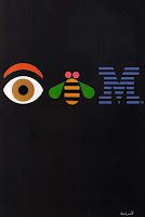
Paul Rand was probably one of the most well known and successful graphic artists of his time. His fame began in his twenties and his acclaim only spread and increased as he aged. He continued to produce designs until his death in 1996. Even though Rand is widely known for the work he produced (such as the logos for IBM, ABC, and Westinghouse), I believe his greatest achievement is showing the world what design meant to him and why it is important. Although many of his designs are still in use today, years after he conceptualized them, I think his other efforts will last even longer. One of the cornerstones of Rand’s work was his belief in simplicity. The aforementioned corporate logos reflect this. They are simple without being simplistic. By using this technique, Rand created images that are appealing and iconic. He also attempted to incorporate styles into his work that were against the established norm. One of the biggest influences in his work was the Swiss style of design. This style of design relies on grids, photographic (instead of illustrated) pictures, and new styles of typography. In this way, Rand managed to merge new style into an industry that had fairly cut and dry rules at the time.
Examples of his work:


Sources:
http://www.areaofdesign.com/americanicons/rand.htm
http://www.paul-rand.com/biography.shtml
http://www.logoblog.org/wordpress/paul-rand/
http://findarticles.com/p/articles/mi_qa5326/is_200605/ai_n21390338
Everything you always wanted to know, but were too afraid to ask...
A chickens' heart beats 280-315 times a minute.
http://shilala.homestead.com/chickenfacts.html
Subscribe to:
Posts (Atom)